Building Analytics Infrastructure That Identified $10M in Risk
OPEXUS was making million-dollar product decisions without data — no feature usage metrics, no customer health scores, no way to connect what we built to what the business earned. I implemented Pendo across five products and built the company's first feature-to-revenue attribution system. When a government reorganization threatened to eliminate our customer base, this infrastructure identified ten million dollars in at-risk revenue and gave leadership the data they needed to respond.
The Problem: Product Decisions Without Data
In January 2025, Thoma Bravo merged OPEXUS with Casepoint. Suddenly we had two product suites to integrate, overlapping features to rationalize, and critical decisions to make about what to keep, what to kill, and what to build — and we had no data to guide any of it. Product decisions were made in conference rooms based on whoever made the most compelling argument. Customer success would say "customers love this feature," engineering would say "nobody uses it," product would split the difference, and in the end we were guessing.
A Concrete Example: The Module Problem
FOIAXpress had three major modules: Case Processing, which handled intake, triage, and workflow and was the core of what agencies bought; Document Management, a repository where agencies could track released documents and search their own archives; and the Document Viewer, where FOIA officers reviewed responsive records and performed redactions. We supported all three equally, allocated engineering resources to all three, and sold all three as core capabilities, but we had no idea how people actually used them.
Leadership assumed all three were essential because the FOIA process is linear — intake, find documents, review and redact, release — and if agencies used our Case Processing module, they surely used our Document Management and Viewer modules too. That assumption turned out to be wrong, but we wouldn't know it for months.
What we lacked: Feature adoption metrics, user segmentation, churn signals, any connection between product usage and revenue outcomes, and any way to validate the product-market fit assumptions we were making every day.
We were supporting features that might not be used, investing in improvements that might not matter, and missing opportunities to double down on what worked. We were about to make decisions that would affect millions in ARR, and I made the case to leadership: we needed product analytics, and we needed it fast.
Why Pendo and Why I Led Implementation
I advocated for Pendo because it could do the three things we needed most: retroactive tracking, which meant we could see what users were doing right now without waiting to instrument first; no-code event tracking, so product managers could define events without engineering work; and Salesforce integration, which would let us connect product usage to revenue data.
Leadership approved the budget but had a question: who would own it? Product management was stretched thin with the merger, engineering was focused on integration work, and customer success didn't have the technical skills. I volunteered. As lead designer I had the technical background (CS degree, comfortable with JavaScript), the customer insight (two years of research), and the strategic context to know which features mattered and why. I also knew this was how design would earn a seat at the strategic table — by speaking the language of business.
Building Analytics Across Five Products
Phase 1: Instrumentation (Weeks 1-3)
I became the sole Pendo administrator and started building the analytics infrastructure from scratch.
I wrote initialization code for five products across both companies, learning each codebase well enough to instrument it correctly and ensure accurate user tracking.
I configured user metadata — role (FOIA officer, administrator, reviewer), agency type (federal, state, local), product tier (basic, professional, enterprise), and usage patterns — so we could slice data by meaningful dimensions rather than just aggregate totals.
I set up track events for complex workflows. A single "FOIA request completed" event required tracking seven steps across three pages, and I learned Pendo's event builder well enough that their product team was surprised when I asked about edge cases at their conference in New York.
The technical work was challenging but straightforward — the hard part was deciding what to measure.
Creating a Single Source of Truth
One of the most valuable outcomes was unifying disparate data sources into a single, authoritative record of what was actually happening across our products.
The Problem Before Pendo
Critical product and customer metadata lived scattered across systems: spreadsheets tracking which version users were on, Salesforce records with customer emails and license counts that were often outdated, manual tallies of how many licenses customers actually used versus purchased, and product managers' intuition about what customers needed, stored only in memory. These sources were rarely updated, so sales would tell a customer "you have 50 licenses" based on Salesforce when the customer was actually using 63, revenue operations couldn't identify expansion opportunities because they didn't know who was at capacity, and customer success couldn't proactively help struggling customers because there was no usage visibility.
Pendo as Ground Truth
Because Pendo tied directly to the backend, it had to be right, and it became the authoritative source for license utilization (actual seats used versus purchased, which identified expansion opportunities worth $2M+ ARR), version adoption (critical for support and deprecation planning), user metadata (roles, permissions, agency affiliations that enabled targeted communication), and product health — who was actually using what, not what we thought they were using.
Cross-functional impact: Customer success used Pendo for health scores, revenue operations used it for expansion signals, product used it for prioritization, and sales used it in renewal conversations. Everyone trusted it because it was real-time and could not be wrong.
Creating a shared, trusted data foundation enabled every team to make better decisions, and it set the stage for the feature-to-revenue attribution work that followed.
Defining Success Metrics
Working with product managers, I needed to decide what "success" actually meant for each product — not just "how many users logged in" but metrics that indicated value delivery. In FOIAXpress, for example, the vanity metric was the number of requests created, while the value metric was the number of requests completed within deadline. The first measures activity; the second measures whether we're helping agencies meet their legal obligations. We tracked both but optimized for the second.
Establishing North Star Metrics
I developed the first north star metric for each of our five products: cases processed for FOIAXpress, documents reviewed for Casepoint eDiscovery, case deflection percentage for the Public Portal, and cases processed for both Legal Hold and OIG Case Management. These weren't just KPIs — they were the single metric that best captured value delivery for each product, and they gave product teams a clear optimization target. If a feature didn't increase cases processed or reduce processing time, we questioned whether it was worth building.
I also created a framework where every feature needed three supporting metrics: adoption (what percentage of eligible users used it), engagement (how frequently they returned to it), and outcomes (whether using it correlated with customer success). This framework would prove its worth almost immediately.
Uncovering Product-Market Fit Gaps
Applying the metrics framework immediately revealed problems we didn't know existed. The three FOIAXpress modules showed stark differences in adoption: Case Processing ran at 85%, used daily and directly correlated with customer satisfaction; Document Management sat at 18%, with most users relying on SharePoint or OneDrive instead; and Document Viewer/Redaction trailed at 12%, with most users redacting in Adobe Acrobat.

Module adoption analysis: Only 18% of customers used document management, revealing product-market fit gap
We were allocating engineering resources equally across all three modules and supporting features with 12% adoption as if they were core product capabilities, having no idea that people were working around two-thirds of our feature set.
The Document Viewer Story: When Research Met Data
Before I had Pendo, customer interviews kept surfacing the same complaint: "Your document viewer is too slow. Adobe is faster." I took this feedback seriously and redesigned the entire document viewer — better thumbnails, instant loading, keyboard shortcuts, bulk actions. The transformation was dramatic:


Document viewer transformation: From tiny thumbnails and 3-5 second load times to full preview with instant loading
We were ready to develop it and were actively showing it to customers in demos, where the feedback was overwhelmingly positive — we thought we had a winner. Then the Pendo data came in. Only 12% of customers used our document viewer; 88% were redacting in Adobe Acrobat and uploading the results back to our system. The redesign would have made our viewer better, but it wouldn't have convinced anyone to switch from Adobe, because people weren't avoiding our viewer because it was slow — they were avoiding it because Adobe had their entire document management workflow (search, OCR, redaction, assembly, Bates stamping) while we had only redaction. To compete we would have needed the full eDiscovery toolkit, not a better viewer.
How This Informed the Merger
I presented this analysis to the executive team. The data was clear: we had product-market fit in Case Processing (85% adoption) but not in document management (18%) or redaction (12%). My bottleneck research had already shown that agencies spent 60-70% of FOIA time finding documents, and the Pendo data confirmed they weren't using our document tools to do it. Casepoint had enterprise eDiscovery — search, OCR, deduplication, threading — along with professional-grade redaction tools. The merger could bring product-market fit to the entire FOIA workflow, not just case processing.
Designing the Integration
When the merger was approved, I designed the integration experience between FOIAXpress and Casepoint. Instead of building our own document viewer, we embedded Casepoint's proven tools directly into our case workflow, turning a product weakness into a strategic advantage. Customers got enterprise-grade document tools without changing their case management workflow.
The full arc: Customer interviews revealed a problem. I designed a solution. Pendo data showed the problem was deeper than I thought. This insight influenced a multi-million dollar acquisition. Then I designed the integration that made it work.
Without data, we would have built a better viewer nobody wanted. With data, we identified the real gap and filled it through acquisition.
Establishing Executive Reporting
The most important thing I built wasn't a dashboard — it was a biweekly report for executives. Every two weeks, the C-suite, VPs, and select need-to-know employees got an email with the same structure:
"Feature X adoption increased 23% after onboarding changes" or "Customer Y is at risk—usage dropped 40% this month"
Daily active users, feature adoption rates, workflow completion rates, error rates
One feature or workflow analyzed in detail — why did adoption change, what do power users do differently, what's blocking non-users
One customer analyzed for expansion opportunity or churn risk, with usage patterns, feature adoption, and recommended actions
What we should do based on the data, with estimated impact for each recommendation
The report worked because it was visual (charts and heatmaps, not tables of numbers), actionable (every insight led to a recommendation), consistent (same structure every time, so executives knew what to look for), and credible (every claim backed by data). Within two months, "What does Pendo say?" became the standard question in product meetings, product decisions required data justification, and design finally spoke the language of business — revenue, retention, efficiency, growth.
Executive summary slide from biweekly report showing key insights and trends
Creating Feature-to-Revenue Attribution
The breakthrough came when I worked with our revenue operations team to connect Pendo to Salesforce, creating the company's first feature-to-revenue attribution system. We could finally answer questions that had been impossible before: which features do high-value customers use most, which features correlate with renewals versus churn, which features drive expansion opportunities, and what the expected revenue impact of a new feature might be.
I built a dashboard that showed, for each feature, adoption rate by customer tier, renewal rate for users versus non-users, average ARR for customers who used it, and the correlation coefficient between usage and customer health score. This changed how we prioritized. Before, the loudest voice in the room won; after, features that drove retention and expansion got built first.
Customer health analysis segmenting accounts by usage behavior and ARR at risk
Crisis Response: Identifying $10M in At-Risk Revenue
In early 2025, the Department of Government Efficiency announced reductions in force at federal agencies. Our customers were about to lose 30-40% of their staff, our per-user pricing model was suddenly at risk, and nobody had data on the scope or business impact — except me.
Real-Time Usage Intelligence
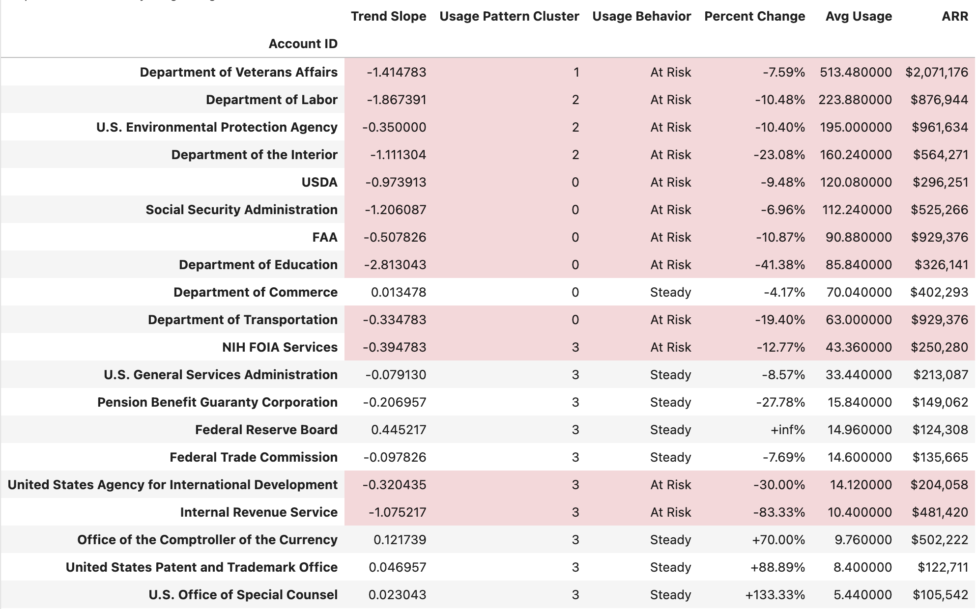
While other companies were speculating about DOGE's impact, I was watching it happen in real-time through Pendo. I could see which agencies were still active, which were seeing usage declines, and which had gone dark entirely. I exported usage data and built models to segment customers by risk level: growing (usage trending up despite DOGE, which meant expansion opportunities), steady (maintaining activity, safe for now), volatile (unpredictable patterns, worth watching closely), and at risk (usage declining sharply, with imminent churn danger).
I overlaid DOGE policy announcements with usage drops to identify which agencies were being hit hardest. This proprietary, real-time view of what was actually happening at federal agencies — not speculation, not surveys, but observable behavior — was something nobody else had. I coordinated with sales and customer success to cross-reference usage data with contract renewal dates, identifying which declining accounts had imminent renewals versus long-term contracts so the executive team could prioritize outreach. Sales used the usage trends in renewal conversations as concrete data proving value during uncertain times.
Result: I identified $10M+ in at-risk annual recurring revenue within 48 hours and created a targeted retention strategy for each risk segment.
This data informed three critical decisions: a pricing model revision that shifted from strict per-user to tiered pricing with usage bands, protecting us from staff reductions while maintaining revenue; proactive outreach by customer success to at-risk accounts with tailored retention offers before they churned; and accelerated development of features that reduced per-user workload, making us more valuable to understaffed agencies.
The usage data also revealed that the Department of Veterans Affairs, our largest customer at over $2M ARR, was showing the exact usage patterns that preceded churn. This early warning let us intervene, though external factors ultimately led to their departure. Without Pendo, we wouldn't have seen it coming.
We retained the revenue, but the larger proof was that design could operate at a strategic level in crisis situations — not with opinions or intuition, but with data nobody else could access.
Key Lessons
The Pendo infrastructure transformed how the company made product decisions. Product managers set KPIs before launch, customer success identified at-risk customers before they churned, engineering prioritized bugs based on impact, and sales used feature adoption data in renewals. The company went from gut-based to data-driven product decisions in four months. This work also taught me broader lessons about how design operates at scale.
Designers Should Own Analytics
Product analytics is often owned by product management or data teams, but designers have unique advantages: we understand user workflows deeply, we know which features matter and why, and we are trained to identify patterns. Owning analytics gave design strategic credibility and a voice equal to engineering and sales. An unexpected outcome was that after the merger, when many legacy FOIAXpress employees were let go, I had become the person with the most in-depth product knowledge in the company — the data work made me the institutional memory.
Infrastructure Enables Strategy
The Pendo implementation wasn't glamorous or visible to users, but it enabled every strategic decision that followed, from the module adoption revelation to the DOGE crisis response to the Public FOIA Portal redesign. Building systems that enable good decisions is as valuable as making individual good decisions.
Data Earns Credibility, Communication Maintains It
The numbers got people to pay attention — "$10M at risk" opens doors — but the biweekly executive report kept them engaged. That report functioned as much as a design artifact as any interface, because I designed it the same way: understanding the audience (executives), their goals (better decisions), their constraints (limited time), and optimizing for scanability and action. Visual hierarchy, consistency, and storytelling aren't just UI principles; they're communication principles.
What I'd Do Differently
I would have involved product managers more in defining metrics from the start. I made some initial decisions about what to measure without enough input, and we had to revise them later. Co-creating the metrics framework would have built more buy-in and caught blind spots earlier. The best infrastructure is co-designed with the people who will use it.